
The infographic is the Salvador Dalí of content marketing. By far the most interesting person at the cocktail party.
Who can compete with the thin, longhorn mustache decorated with forget-me-nots? The anteater curled at his feet?
His closest peer, the video, dozes near the crackling fire … slippered feet propped up, face buried in a white beard.
The podcasts, hovering in the shadows, laugh at all his jokes in between sips of sparkling wine.
And the blog posts? Yeah. The blog posts go home to weep themselves to sleep.
The infographic holds court. He is the darling of the content marketing world. For good reason.
Research suggests that publishers who use infographics grow in traffic 12 percent more than those who don’t. This is because an infographic, unless it’s completely awful (and they exist), will more than likely go viral.

These posters full of facts, catchy images, and sexy fonts catch the eyes of just about everyone, including journalists, which drives engagement and links.
A good infographic gives people permission to preen. It gives them a sense of pride to share something damn cool on social media (from Twitter to Facebook to Pinterest), or more importantly, on their websites.
But infographics are not without their drawbacks.
The flaws of infographics
For starters, Google can’t index the content in your infographic. This is a problem that is true for any image (including video). Crawlers are just not sophisticated enough to sniff out the words. With video you can get around this obstacle by sharing the transcript.
With an infographic, however, it’s a little more complicated. But I’ll explain later.
And not surprising, Google has a shaky relationship with infographics. Last year, Eric Enge of Stone Temple Consulting sat down with Matt Cutts to talk about, among other topics, infographics.
Here are some of Cutts’s comments about bad infographics:
- “They get far off topic.”
- “The fact checking is really poor.”
- “Often the link goes to a completely unrelated site, and one that they don’t mean to endorse.”
- “The link is often embedded in the infographic in a way that people don’t realize, vs. a true endorsement of your site.”
And yes, Cutts did say, “I would not be surprised if at some point in the future we did not start to discount these infographic-type links to a degree,” but he also said, “Any infographics you create will do better if they’re closely related to your business, and it needs to be fully disclosed what you are doing.”
In other words, get the infographic right and it can be a boon for your business. The traffic alone is worth it. But I’d like to argue that you leave a ton of attention, traffic, and money on the table if you stop at that.
There is so much more to do with our little darling of the content marketing world.
Let me show you what I mean.
The infographic as an asset pillar
I want you to think of the infographic like a pillar — a pillar that reaches back in the past and extends into the future. It reaches back to revive old content and extends forward to create more content.
In his video tutorial, Jesse Noyes, senior director of content marketing for Kapost, states the importance of “creating a content process” where you choose ideas, outline clear goals, assign project owners, and produce supporting assets.
What I’d like to offer you is that an infographic is that process. As an asset pillar, it is a ready-made process. But everyone misses this.
Here’s the typical way most people approach infographics:
- Hunt down the sources.
- Combine the content.
- Design the layout.
- Publish to much fanfare.
- Go into outreach mode.
- Move on to the next infographic.
As you might expect, the shelf life of each image gets shorter every day. It’s an arms race that can exhaust even the most productive teams.
Instead of nursing this myopic view of infographics, what you need to do is consider the type of content you are going to create next.
This might mean you:
- Write a series of posts.
- Record a podcast series.
- Design a SlideShare presentation.
- Create a typography video (like this one on content marketing).
- Publish an ebook.
- Syndicate articles.
- Produce an email autoresponder.
- Or all of the above.
Derivative content from your asset pillar is part of the idea creation stage in your process.
And here’s why this is important. Studies show that the top three challenges facing marketers are time, producing enough content, and producing content that engages.
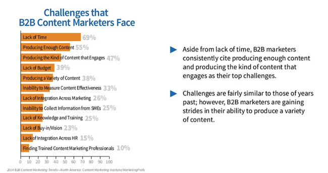
If you could reduce the time spent generating ideas, you’d have more time for execution.
That’s what can happen when you view infographics as asset pillars.
The power of repeating yourself
There is something peculiar you ought to notice about successful infographics …
You don’t have to share groundbreaking material.
You can cover old territory. This is what we call publishing around a “solved problem,” as Gregory Ciotti defines it.
Take our 11 Essential Ingredients Every Blog Post Needs infographic. This has been Copyblogger’s most popular post in 2014. And there is nothing groundbreaking about it. The material answers questions that have been answered long ago. It’s a common theme — that will never die, that will never lack an audience.
Great producers know this about evergreen themes, and don’t shy away from it. A few years ago, Men’s Health magazine was supposedly busted for copying their covers. Yet, Editor-in-Chief David Zinczenko said that it wasn’t a mistake. It was part of a deliberate branding strategy.
One look at four of their covers and you can quickly figure out what they wanted to brand.

Their emails didn’t vary (at all) from these themes either.
I guess there is some truth to the old adage that men have a one-track mind. Whatever.
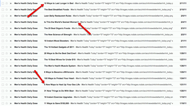
Here’s the lesson. Because of audience turnover:
- You will always have a market for evergreen topics.
- You should never overestimate the sophistication of your market.
- You should always assume nothing about your content.
So don’t be afraid to hang evergreen themes on an infographic. As Brian Clark said in a recent New Rainmaker webinar, “The hardest thing to do with content marketing sometimes is to repeat yourself.”
Here’s a good example of what I mean.
My favorite infographic in the whole world
It is this one on death.
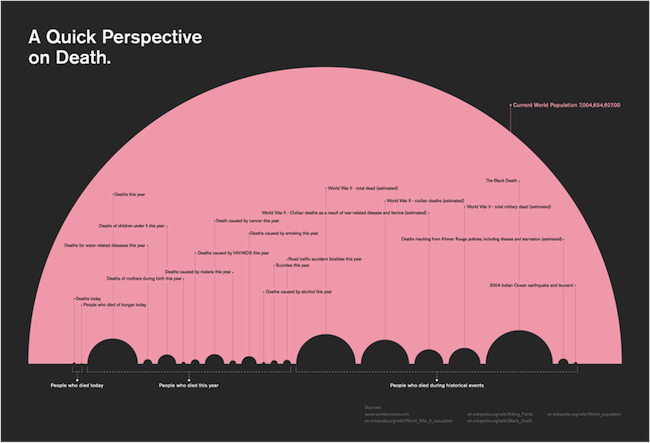
This is the quintessential infographic. It has taken complex data and made it visually appealing. It’s simple and concise. You get what’s going on very quickly. And if you think there is one topic we’ve beaten like a dead horse, it would be death.
Yet, this is appealing.
If you were a journalist, you could use this infographic for a series of articles. In one quick glance you could map out your production for the next six months.
Let’s say you focus on “People who died during historical events.” Your list of articles might look like this:
- World War II – civilian deaths
- World War II – military deaths
- Deaths from Khmer Rouge policies
- The Black Death
- 2004 Indian Ocean earthquake and tsunami
And that’s just the right side of the infographic.
This infographic is an asset pillar.
How your high-value content can be repurposed over time
When you have evergreen content packaged up in an infographic, it will probably be your most popular format. It will be more popular than the original blogs. It will be more popular than the SlideShare presentations. Or the podcast series.
Here’s an example.
The most successful infographic on Copyblogger is one about grammar goofs.
The content of that post came from three old posts that Brian Clark had written. We took good content from the archives and brought it back to life — all themes that have been covered countless times.
And while the social production we squeezed out of those original blog posts wasn’t too shabby, the infographic not only launched through the stratosphere, it completely and utterly entered another dimension.
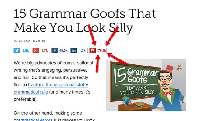
Viral seems too weak a word.
If we were smart (which we are, but we’re just as pressed for time and resources as everyone else), we’d get some more mileage out of that infographic by flipping it into a video, podcast, and SlideShare. (I guess now I know what will be keeping me busy for the next two months.)
In fact, we did do this with our 11 Essential Ingredients infographic. That post combined 11 different articles from the past, summarized the lesson from each article, and then linked back to those articles, driving even more traffic down that path.
But we weren’t done.
Squeezing more out of your content
After we published the 11 Essential Ingredients infographic, Jerod Morris and I used those 11 ingredients to hammer out a podcast series where we expanded upon each ingredient.
In our preparation for each podcast, we brought more research to the original discussion. In a sense, this allowed us to update each article. We added value to the ongoing conversation.
In fact, at the end of each article, we could say, “Hey, this article was great, but you should listen to the podcasts for more information.”
And eventually we flipped the infographic into a SlideShare presentation, giving us even more reach from that original asset pillar.
Next in line is an ebook, then a landing page, and so on.
Flip a podcast series into an infographic
This idea flows backwards, too.
Where the two above examples reached back into the files to create an infographic (and then reached forward to hand you the podcast), we are going to do the opposite with our content curation podcast.
First, we recorded and published the podcast series. Next, we’ll flip that series into an infographic. And from there I have a handy list of topics to write on in the future.
(Seems like I’m going to be pretty busy until the end of the year. At least there’s job security in asset pillars!)
This is nothing more than an idea package with the infographic serving as the centerpiece. The asset pillar. And the life of the party, so to speak.
Another reason you should embrace this approach
It involves reaching the widest possible audience with an idea by presenting that idea in as many learning styles as possible.
Learning styles boil down to three categories.
1. You prefer to read
Believe it or not, people do read online. It’s just rare, and when they actually do read, you can’t expect people to consume every single word. Maybe the first ten. A little more if the article is really good.
Farhad Manjoo hammered this point home hard with You Won’t Finish This Article.
Schwartz’s data shows that readers can’t stay focused. The more I type, the more of you tune out. And it’s not just me. It’s not just Slate. It’s everywhere online.
Yet, while the pool of people who like to read online might be small, it’s essential to honor their learning style. It just makes sense to present evergreen content in as many learning styles as possible.
For example, there are people who prefer to scan a transcript rather than watch an 11-minute video.
And while people may not read that 1,000-word missive on the lessons you learned while hanging out at Machu Picchu, they will bookmark it for later use.
Even if they don’t read every single word of your blog post, they might when it becomes an email course or ebook.
Furthermore, another segment of your audience will want you to expand on a point you made in an infographic. Pointing to relevant content (or writing it if you don’t already have it) will get that job done.
2. You prefer to hear
Hearing may not only be a preferred style of learning, but audio has the added benefit of “eyes free” content.

You can listen to books, podcasts, lectures, sermons, or college courses while you ride the train to work or carefully cast a plug near a rock in a trout stream. Your body is one place while your mind is somewhere else.
Give people this choice and you will extend the life of your ideas.
3. You prefer to see
And finally, many of us prefer to see.

The same logic influences the trend of sharing more and better images for your blogs posts.
But of course, this is where the infographic really shines.
It takes data and makes it simple, beautiful, and fun (see the section above on the death infographic).
All in your asset pillar.
Your digital building blocks
While most people would agree that infographics are sexy little assets, I’ve also demonstrated that it’s safe to say they are also workhorses. Tireless beasts of burden who easily overcome any limitations they might have.
The bottom line is you’ll always need to educate people on the fundamentals because there is constant turnover in your industry and in your audience.
Every two years you’ve got a whole new crowd who doesn’t know what you’ve done before. In addition, those who master the basics will move on to your advanced content and courses.
But — and I don’t care who you are — we always need a good reminder of what we once knew. We just might need it in a different way. Maybe a new perspective. Perhaps with a different angle, hook, or voice.
You can do this without having to reinvent the wheel, doubling down on more resources, or wasting your time coming up with original ideas every time.
Let us know on Google+ how you plan to use infographics to display your fundamental content, as well as create different types of media from the content in your infographics.
How to build your own online empire out of cornerstone content …
To learn how a content asset pillar like an infographic fits into a broader online media strategy that will help you develop your audience, register for the New Rainmaker content library — a free (for now) series of podcasts and webinars in which Brian Clark distills the most important lessons he has learned about building a successful online business.
Flickr Creative Commons Image via La Tête Krançien.


![[08] 10 Goals that Make Content Marketing Meaningful](../../rainmaker.fm/wp-content/uploads/2017/07/sites-008.jpg)

