Visitors who don’t click don’t convert.
As marketers, we know this to be true.
Your visitors can’t get through your checkout process or sign-up form without clicking at least one button. And that one button — like all of your buttons — can be improved.
But we fail to optimize calls to action for pretty simple reasons, all of which are complete BS.
We need to stop ignoring the so-called “small things,” especially when conversions depend on them.
Instead, apply a few of the following click-boosting techniques in this post, which A/B tests have proven can generate conversion boosts ranging from 20 to 95 percent.
No more excuses
See if you can relate to any of these excuses for failing to optimize calls to action:
- It’s hard to get creative when you’ve only got room for two or three words on a button
- Everything seems best summarized as “Learn More,” “Sign Up,” or “Buy Now”
- If people really want my stuff, the button isn’t going to make or break a conversion
- Buttons are small — we’ve got bigger fish to fry than that!
Those excuses are like a ceiling blocking your conversion rate from lifting. Your call to action isn’t supposed to summarize … it’s supposed to get people to act.
You shouldn’t limit your button copy to a three-word maximum. A button that fits the standards of every one-percent-converting site should not be the button you expose to your hard-won visitors.
You’re not writing copy for visitors who would walk over hot coals to get your stuff. You are most often writing for people who are on the fence and who can be pulled over to your patch of grass with great messages.
So let’s cut the excuses and start using techniques we know will work, like the six data-backed methods for improving conversions explained below.
1. Entertain the lizard brain
Here, here and in the must-read Neuromarketing: Understanding the Buy Buttons in Your Customer’s Brain, we learn that the amygdala — aka our “lizard brain” — is the part of our brain that has been around for 450 million years and still powers our actions:
The old brain is a primitive organ, a direct result of the basic evolutionary process. It is our ‘fight or flight’ brain — our survival brain — and is also called the reptilian brain because it is still present in reptiles today.
~ Renvoise & Morin, 2007
Part of our survival instinct is the tendency to notice differences in our environment. We’re hard-wired to.
Valid reasoning and the written word haven’t had even a fraction of the time necessary to be part of an ‘instinctive’ response in us. For this reason, we need to rely on more than “If X, then Y” reasoning and written messages to make a sale or get a signup.
Consider these buttons, which were, until recently, on the Plans & Pricing page for AcuityScheduling.com:
Of those three buttons, which one stands out the most?
The different one does — the third and final one in the row. It uses different copy than the first two, and it’s the only button supported by a second line of copy.
Because the third one here stands out, our lizard brain is most entertained by it. So we’re most likely to zero in on it and make a decision that considers it. For Acuity Scheduling, that meant the third button, which is for their $0 plan, was getting the most clicks.
Not great for paid conversions.
So we tested two different button treatments against it.
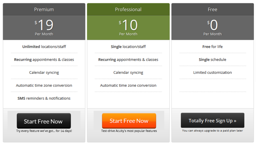
Variation B, shown below, incorporated a second line of copy below each button. It also used a different color on the button of the middle-of-the-road plan.
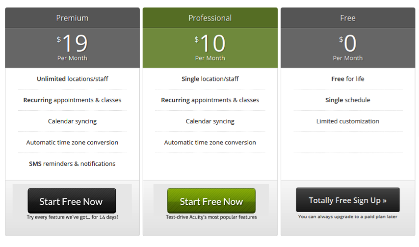 Variation C, shown below, repeats what we did in Variation B, but the new button color is orange.
Importantly, in both treatments the button copy for the two paid plans was identical and, at first glance, only the button color seemed different. This is by design.
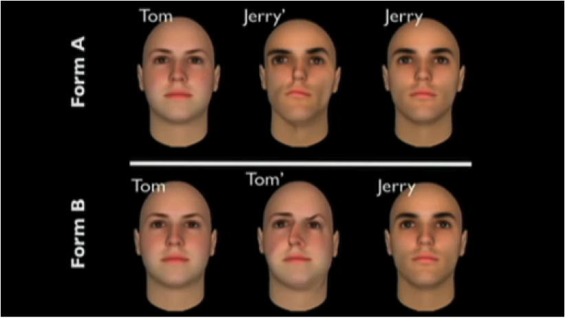
It leverages the insights of Dan Ariely’s “Ugly Tom / Ugly Jerry” experiment (Auto-Play Video), where subjects were first asked to choose who was more attractive, Tom or Jerry. Here’s what they saw:
Ariely also presented the following sets of options to groups of subjects:
Ariely found that, for those who saw Form A, attractive Jerry was most popular; for those who saw Form B, attractive Tom was most popular. This illustrates how people tend to compare the two most similar options in a set — eliminating the radically different option — and from the two similar options choose the more attractive one.
This Acuity Scheduling button test isn’t an identical duplication of Ariely’s test. But it does force similarities between the first two options and then make one of those two more attractive to the lizard brain by making it a standout color.
Let’s see the treatments again:
Control
Variation B
Variation C
These very minor changes resulted in big improvements in account starts. Variation B (the green button) saw an 81 percent lift over the control, and Variation C (the orange button) saw a 95 percent lift over the control.
Beyond the Ugly Tom / Ugly Jerry effect, this test also highlights a reptilian tendency to look for color: the orange button was outside the green-grey-black color scheme of the page, drawing more eyes than the green.
It’s human nature to appreciate contrast. Bet you didn’t know that the greater the contrast between a flower and its background, the more likely a bee is to prefer it.
2. Focus visitors on simple calls to action
You’ve read about the paradox of choice and analysis paralysis. So you know that people generally (but not always) have a hard time making a decision — and feeling good about that decision — when they are presented with a lot of options.
Can adding more buttons to a busy page help reduce the crippling effects of choice overload? And is choice overload a real thing?
In this popular Jam Experiment, Columbia’s Sheena Iyengar presented some patrons of a high-end grocery store with six jams to sample and other patrons of that same store with 24 jams to sample.
The 24-jam display attracted more people than the six-jam display, but it converted far fewer into paying customers.
 Photo credit: sheenaiyengar.com
The takeaway? People think they want a lot, but having fewer options makes it easier to arrive at a choice confidently.
Additionally, fewer choices can improve how satisfied we are with our decisions.
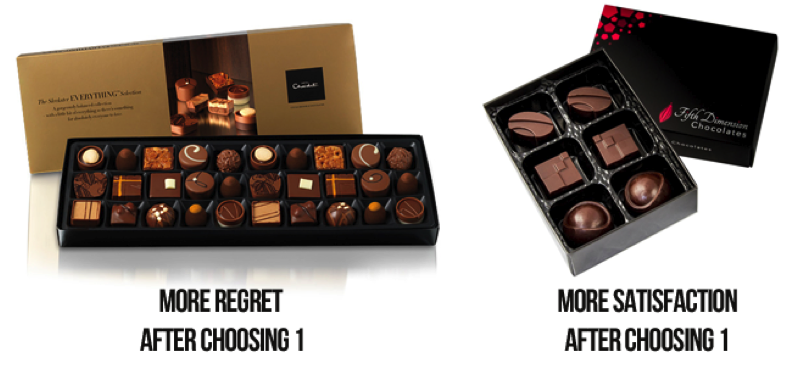
In another study by Iyengar, participants who were given six chocolates from which to choose one were happier with their selection than those who selected one chocolate out of 30 possibilities.
Fewer choices may make your visitor feel happier. And happiness is an extraordinarily powerful emotion for converting people, getting them to talk about you, and keeping them loyal to your brand.
Think about your home page — how many options do you give your visitors?
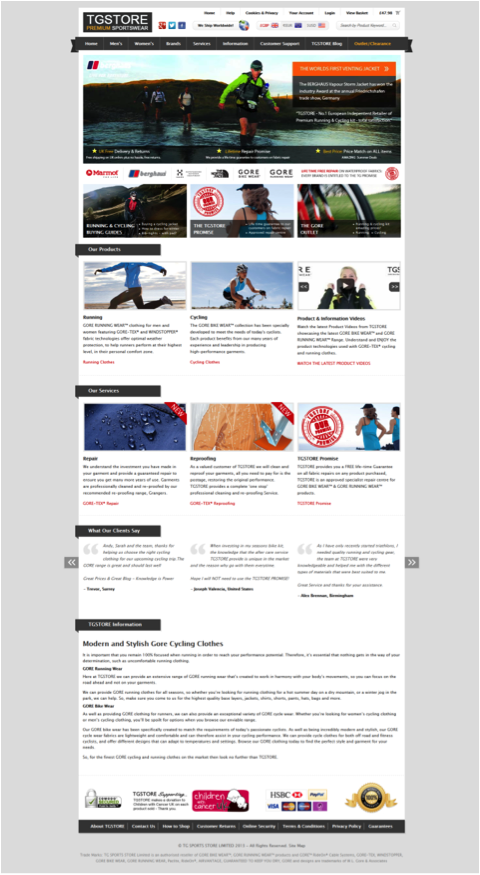
We tested simplifying options on the TGStore.eu homepage, which presents visitors with loads of information and options largely because they have so many SKUs.
Many ecommerce sites experience the same problem when trying to figure out what goes on the home page — they end up throwing everything on there, like TG did:
This is a page filled with visual stimuli: images of men, images of women, landscape shots, bicycles blurred in motion, runners running, water beading on fabric. And nearly every image on the page has copy overlaid on it or positioned just below it.
With so much info and so many distractions, could visitors be burdened by too much choice when landing here, and could that be negatively impacting clicks deeper into the site?
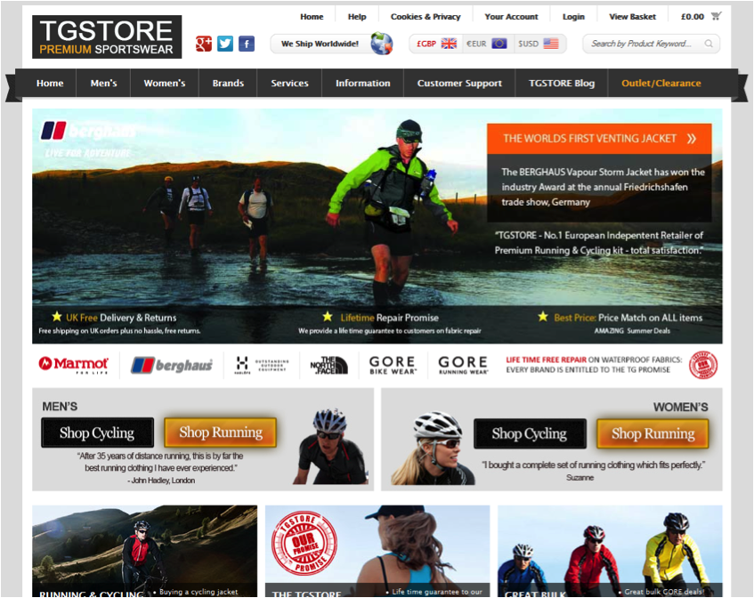
To find out, our treatment presented half of TG Store’s visitors with a home page that looked like this (above the fold):
Can you spot what we did? We added in four new calls to action. Yep, in a page filled with places to go and things to do, we gave people four more things to do.
So how might offering more choices help minimize choice overload? Answer: by focusing visitors on clear, unmistakable calls to action that simplify their decisions.
For the part we added in, we kept the background neutral to eliminate visual distractions and simplified options into manageable sets of decisions a visitor can painlessly make:
- Decision 1: Identify yourself as a man or woman
- Decision 2: Choose between cycling or running (the two most popular category pages on the site)
The buttons are the same on both the men’s and the women’s — same coloring, same copy — to avoid competition and distraction.
With these new calls to action, TG Store saw 96.6 percent more visitors go to Shop Cycling (Men) and 104.5 percent more go to Shop Running (Men), both with 100 percent confidence. The women’s buttons also trended above the control but didn’t reach confidence.
Now, this might feel like one of those tests where you think, “Well, that goes without saying. When you give people new options that weren’t there before, you’re going to get more clicks to those pages.” But that’s our job as online marketers.
We’re supposed to see where visitors most like to go on our sites — by using analytics and keywords — and help them get to those destinations without interruption.
3. Make buttons look like buttons
The subject of signifiers (sometimes called affordances) is a big one in the user experience (UX) world, and in conversion.
When we’re talking about signifiers in web design, we’re generally talking about making elements on a page look like what they’re meant to be used for.
In other words: A button needs to look like a button.
Users need to identify it quickly as an element to click in order to initiate an act.
So, would a first time visitor coming to your page absolutely know which elements are clickable? Or would they be like Ariel when she found a fork, naively guessing at what to do:
Buttons are easier to click when we know they’re clickable.
This is why grey buttons are generally poor for conversion — they look disabled, so a lot of visitors won’t know they’re even allowed to click them.
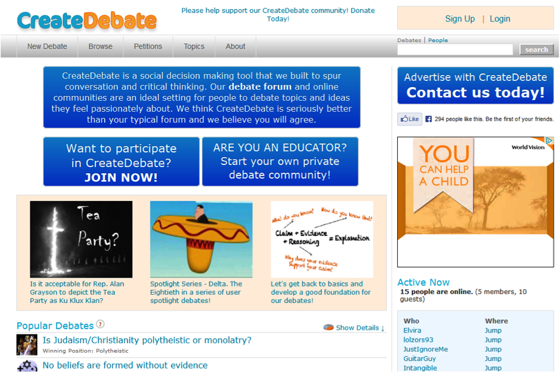
The home page of CreateDebate.com is filled with calls to action to join various debates in progress. And above their fold, they were burdening visitors with what appeared to be even more calls to action in the form of four huge buttons:
In fact, the largest blue ‘button’ isn’t a button at all. But it sure looks like one, doesn’t it? All those buttons weren’t helping visitors understand what they should click on.
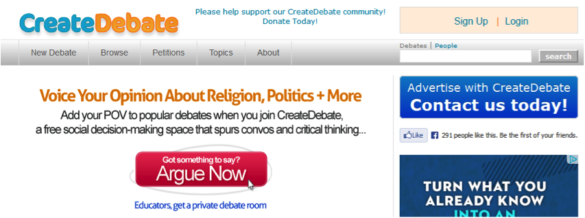
We tested a single, obvious call to action – one that had all the signifiers of a button, including the image of a cursor on it — against the control.
The following treatment created a 45% boost in account starts:
While you may not have body copy in something that appears like a button, you may have the inverse on your site: buttons that do not signify “Click Me.”
Can people easily identify the primary call to action on each page of your site? Is that call to action easy to acquire (e.g., large enough)? Does it bear signs suggesting clickability?
Consider the following:
- A 3D effect
- A contrasting, non-grey color
- Feedback on hover (e.g., different color)
- Whitespace around it
- An arrow pointing to it with instructional copy
Your designer might really want a flat-design button. But before you hop on the flat-design trend … test.
4. Write button copy in the first person
A great rule of thumb when writing a call to action is to make your button copy complete this sentence:
I want to ________________
That little trick is how we get buttons like Find Out How to Ride a Bike and Make Sense of My Finances Fast. It’s also how we avoid buttons like Register to Learn More … because no one wants to register to learn more.
That formula leads us down the path of writing calls to action in the first person.
Writing this way feels pretty uncomfortable when you first start doing it. But time and again we see it work in split-tests, which reinforces — at least for me — that the more uncomfortable your copy makes you, the more likely you’re doing it right.
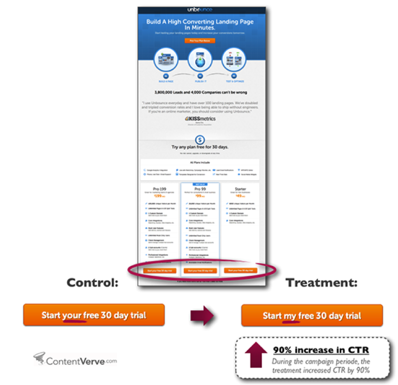
Michael Aagard of Content Verve shared two tests in which he saw a 25 percent increase and a 90 percent increase in clicks on buttons that were written in the first person. Note that in both cases the control was in the second person, by which I mean it used the word “your” instead of “my.”
Here’s the one that brought in 90 percent more clicks:
 (Source: Unbounce)
The only difference between this high-converting button and the lower-converting button was whom it seemed the button was built for.
Taking this idea, we tested the following two buttons on a Schedulicity.com landing page:
CONTROL
TREATMENT B
Treatment B, which is in the first person, generated a lift of 24 percent with 98 percent confidence. Of course, Treatment B also eliminated the phone number (without negative impact on the business) and introduced more benefits-focused language.
If you’re unsure if the first person approach here really worked, see how it helped in the next button test …
5. Boost your buttons with “click triggers”
In this book, I introduce the term “click triggers”, which are essentially the extra boosts you put around a button to convince more people to click it.
The way I see it, there is a wall standing between your prospect and a conversion. Our job as marketers and copywriters is to get people over the wall by:
- Knocking bricks down, virtually eliminating the wall
- Sliding boosters under our prospects’ feet until they are high enough to step down from the wall
To knock bricks down, we overcome objections and reduce anxieties. To slide boosters underfoot, we delight.
Click triggers do this work at the point of conversion and can include:
- A testimonial, review, or tweet
- A data point
- Star ratings
- Low-price messaging
- Guarantees
- Free or two-way shipping messaging
- Payment-option messaging and/or icons
- Security messaging and/or icons
- Privacy messaging
- Risk-minimizing messaging (e.g., a snippet about what happens after clicking)
- Your value proposition
The challenge is not simply using a click trigger near a button — most of us are already doing that. The challenge is to use the right click-trigger near a button.
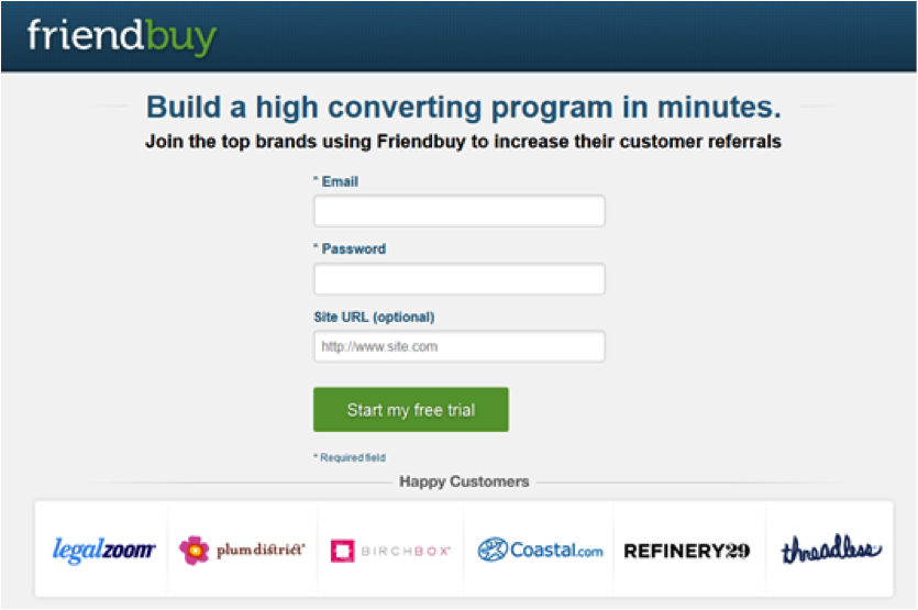
On the signup page of FriendBuy.com, this is the call to action to submit a three-field form:
It has no click triggers around it. Here’s how it looks in the context of the page:
We tested two variations against this, both of which incorporated a click trigger.
Variation B used a testimonial:
Variation C used two objection-reducing bullets:
Which one won? Variation C beat the control by 34 percent with 99 percent confidence.
Simply by adding two click triggers — one an anxiety-reducer about credit cards, the other a key benefit of the solution — FriendBuy now sees 134 signups for every 100 it used to see.
Variation B didn’t reach confidence, but it did trend above the control by approximately 15% throughout the test.
Moral of the story? Click triggers are good. And you should test to find the right ones for the right points in your conversion funnel.
A click trigger that will get someone to click from a home page is very different from the one that will boost conversions on a checkout page.
6. When visitors are ready, unleash the awesome
Your calls to action in your checkout process — whether you’ve got an ecommerce or SaaS business — are definitely not the time to start hesitating or playing it cool.
It is in your checkout that you most need to pull out all the stops to get that button clicked and transform a visitor into a customer.
If you’re only going to run one A/B test this year, make it a test of your Cart call to action.
Among the checkout and signup button tests I’ve run or studied in recent years, the best wins have come from:
- Increasing the size of the primary button
- Using a higher-contrast color for the primary button
- Greying out or visually ‘cooling’ secondary calls to action (e.g., “Update cart”)
- Moving the position of the primary button above the fold
- Removing competing calls to action, like email opt-ins
- Removing the global navigation
- Adding influential testimonials
- Adding risk-reducing messaging near the button (e.g., “Next, you’ll review your order”)
- Offering multiple payment options, including adding PayPal
Security icons can often help too, but that’s especially tricky and worth a test. The reason is that, for some visitors, security icons can introduce anxiety where none existed. To be sure you’re doing right by your visitors, test it.
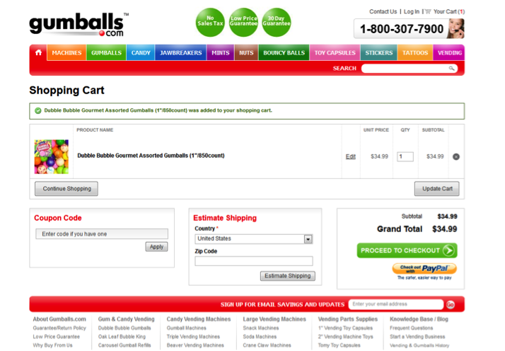
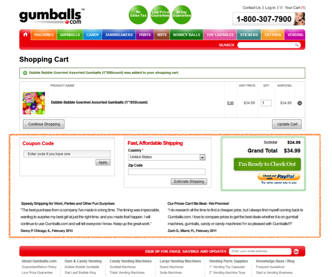
In this test for Gumballs.com, we got a paid lift of 20 percent by, above all, focusing visitors’ attention as much as possible on the button instead of on distractions.
Here’s the control:
And here’s the treatment that generated 20% more paid conversions, with the changed area highlighted for you (i.e., within the orange box):
Using nearly everything covered earlier in this article, we did the following in the winning treatment:
- Drew the eye away from the bright coloring of Coupon Code (which can increase cart abandonment) and Estimate Shipping by adding a thicker green-and-glowing box around the primary call to action. (Note that we couldn’t change that bright red font color for this test.)
- Changed the button copy to the first person: “I’m Ready to Check Out”
- Made the button slightly bigger
- Used testimonial click triggers to boost clicks while separating the primary call to action from the distraction of the opt-in call to action
We also replaced the instructional “Estimate Shipping” copy with the benefits-focused “Fast, Affordable Shipping.”
With just a few simple tests …
These are quick, simple changes that are insanely easy to test. And they resulted in a statistically significant increase that effectively grew the Gumballs.com business by 20 percent.
Now imagine if you optimized your checkout button as well as the other buttons on your site, thus driving more people into your cart only to get more of them to convert.
How much could your web business grow with just a few tweaks to a few tiny, insignificant buttons?











![[08] 10 Goals that Make Content Marketing Meaningful](../../rainmaker.fm/wp-content/uploads/2017/07/sites-008.jpg)
Is it really necessary to say “mofos”? Do you think that makes you cool? Really. Young people!
I won’t interfere with Joanna’s word choice in her bio since she knows what she’s doing, but it’s good to see you here, Bob!
You know I am a huge admirer of you and what you do … and her article is terrific … but using language like that is unprofessional and offensive — at least to people in my generation.
It’s ridiculous that that was your takeaway from this whole article. I think a real professional adult can deal with pseudo-profanity. Everyone in my office drops f-bombs like a mofo and we still manage to get the job done and make profit. Seriously, get over yourself.
I’m with Brian … good to hear from you, Bob. Big fan, sir.
Bob, how cool to see you read my article! Sorry “mofo” offended you. I’m a big U2 fan, and I suppose I’ve used that word since they wrote a song with that very title — so it doesn’t seem like profanity to me at all. With cool startups like VinoMofo – and my own biz – openly using the word, it seems to me to be losing any sense of being ‘a bad word’.
But I respect what you’re saying and hope the rest of the article worked for you.
Yes, it did.
My guess is Joanna has a solid sense of the language that will work for her customer, but I’ll echo the others, it’s great to have you here, Bob!
Thanks. If it might offend even one in a hundred, why risk it, when you can say the same idea without the profanity?Also, she is using it with her READERS, not her customers, and I am one of them … and I am offended.
And on the other side of the ‘what if it offends 1 in 100’ argument . . . what if it attracts an extra 5 in 100?!
I’m down with the mofo business and ting (that’s slang for ‘thing’ 😉
Matt, the answer is their are standards of behavior and foul language violates those standards. And attracts people is the content, not her use of mofo.
To avoid the perception of me being a mofo, I try not to come into someone else’s house and tell them how to F#c$in’ talk, but that’s just how I roll … excuse me, that’s just how I conduct myself when frequenting a blogging establishment. Good day sir.
Shane, what you are missing is that I did not come into her house. This is a public forum, a free site anyone can visit. There are certain standard for public behavior, and not cursing is one of them? I am curious: how old are you?
Manners also belong on a public forum, along with good word choice.
In my book Mofo is just a word, and a pretty tame one at that. Of course this is subjective, obviously it is something else to others.
But what’s the golden rule after all? If you don’t have something nice to say, try not to say it.
I’d rather see “questionable” word choices be glanced over and forgotten than see people draw strong lines of division between one another. It just feels like wasted energy to me, energy which we could be putting towards all of our wonderful projects!
Word choices and semantics aside, we are all friends here working towards a common goal.
I stand corrected; you came into Brian’s house and corrected his guest. Much better that.
I am curious: how much older are you? Good day sir.
This is not “Brian’s house.” It is a public forum in which profanity should not be used and I pointed that out. I ask your age because the younger generation is increasingly ill-mannered.
I suspect we’ll have to agree to disagree on this one.
Great article, clear with excellent examples. One of the things we are always playing with is our call to action. Thanks for the info.
Great, Joyce! I’m glad to hear it. Big wins in store for great button tests.
Some great tips and ideas. Already sent a proposal with these changes.
Nice! I hope you get some winning tests out of it.
Great article, Joanna. I recently launched my squeeze page and timing couldn’t be better for these tips. I will definitely test some tips of yours.
Very cool, Matiss! It’d be great to hear how your tests work out. Post them later, cool, and tweet me?
WOW, what a collection of useful information. Who knew that changing a lowly button could accomplish so much. I find it really interesting, Joanna, that changing a button to first person can have such a radical effect. As a mystery/suspense writer, I love to write in the first person if my plot allows it. First person adds so much more emotion and really brings you into a story. If I need to write in third person, I go for a deep POV and show rather than tell.
As an example…
(Shallow POV) Becky’s skin prickled with excitement.
(Deep POV) Shadows loomed. The room reeked of ancient secrets. Becky’s skin prickled.
I think Deep POV might be a useful copywriting technique, especially for long copy. Jill Elizabeth Nelson has a great book in the Kindle store on Deep POV that has a lot of great examples.
I’ll definitely have to pick up your copywriting fundamentals and test some new call-to-action buttons on my site.
Fantastic reference to deep POV. Long copy can do a lot more with that than a button can (usually), but thinking about POV at all when writing your call to action is clearly critical. Thanks, John! (BTW, I too write fiction, and my first novel in a trilogy is being published this Jan. Exciting times!)
Good luck on your book, Joanna. Fiction is a challenge, but it’s really a lot of fun. I think you are smart to go for a series. Having multiple books is a major advantage. I’m working to finish my first book in a new private detective series that takes place in the late 80’s on the West Coast of California. My protagonist is like a West Coast Don Johnson. Longish hair, big collars. Mofo was actually a pretty popular term back then.
Awesome article.. you’ve triggered my learning button. Thank you
Awesome, Sharon! Glad to hear it.
Thank you for your immense wisdom, Joanna. You turned my grey area in marketing into bright and lively orange and green.
LOL! Good one, Daniel. From disabled to enabled + attractive – nice.
Thanks for the great tips and hacks for buttons! The best option is simplicity, while still being able to stand out and be unique. Thanks for sharing your research, it will definitely come in handy!
Cool, Annie! Simplicity is always a great goal, and sometimes it even gets you more conversions. Other times, bright “Belcher buttons” do the trick.
Todd, ignorant comment. Who said that was my takeaway from her great article? I SAID I loved the article. What I object to is the language. Just because you work in an office with foul-mouthed people does not make using such language acceptable for publication. At least not to people in my generation.
Brilliant! I am aware of a little of this, but seeing the evidence is powerful. Thank you for your post, Joanna.
Cool, Alyson! I’ve decided to make it my life’s mission to get the poor li’l button some of the respect it deserves. 😉
Very well done! These are superb suggestions, and I love the illustrations. Too many articles or posts about improve forms or calls to action do not SHOW us what the author means.
Thanks.
Yeah, Chris, illustrations make everything a lot clearer, don’t they? In copywriting and teachin’, I’m a firm believer in “show AND tell” (as opposed to the oft-quoted fiction-writing rule of “show don’t tell”).
Joanna you f…ing ROCK! Thank you for this great article. You nailed it. “God is in the details” I’m working on two sites right now where call to action buttons are very important as part of the sites. Now i got facts to back up design decisions.
Watch your mouth, Adolf! 😉 Please take the examples and test results to make the buttons on both your sites get the clicks they need.
Great post! I especially enjoy the bit about making buttons look like buttons, ha ha. I mean if the visitor doesn’t notice that the button in present, it probably won’t get that many clicks.
Seems so obvious, doesn’t it, Shawn? But it needs to be said. Most of the obvious stuff needs to be said. We’re very busy trying to innovate – especially online – and that can be fantastic… but it can also mean we leave basic practices in the dust, which is less fantastic for users + conversion.
Boy, this is some quality stuff here – I’ll have to come back and read through it again.
I use buttons on my ESL website and pretty much just stick with the stuff PayPal gives me. I’ve recently started putting copies of the paid buttons from the product pages into detailed blog posts about those products.
I used to just include a link to the product but, hey, why not just make it easier for my users, huh?
Totally, Greg… but if it interests you – since you mention [text] links – we ran a test of “juicy” buttons against a plain ol’ text link, and the freakin’ text link won. That surely won’t always happen, but it did in this one case, and it made me uber-glad that we tested instead of just rolling with best guesses.
What an incredibly useful article, Joanna! Website projects have been coming my way more than anything else lately, so your information is quite timely. Thank you. I’ve been a respecter of your work for awhile now.
As I read #2 Focus Visitors on Simple Calls to Action I started thinking about how this might apply to marriage (believe it or not.)
I’ve noticed how my friends from cultures who practice arranged marriages or live in smaller populated areas tend to have happier marriages and are more content with their marital decision, which on the surface seems amazing considering they had fewer choices.
Meanwhile, many of my compatriots here in the States are less happy in their marital choices and many end up returning the product (divorce.)
Does the fact that Americans having a “24-jam display” instead of a “six-jam display” somehow correlate with this?
Maybe.
Personally, I had a “clear, unmistakable call to action” that helped me find a great wife.
Wow. This article is even more amazing than I first thought…
Major comment, Matthew! That’s like a post onto itself — and, actually, it probably warrants a post. (You should write about it!) Choice is a very tricky thing: we think we want it, but is it good for us?
Interestingly, there’s another box-of-chocolate study where two groups were given a box of chocolates from which to choose a single chocolate. For one group, after a subject chose a chocolate, the lid of the box was closed; for the other group, the lid stayed open post-choice. Guess who was happier with their choice. The group that chose a chocolate and then had the lid closed on their options was happier than the group that got to see everything “they’d missed out on”. So curious!
awesome article! I took notes and hope to apply this testing to a new site launch! I will use this for my own site as well. thank you!
THIS.
Joanna, as always, you are most brilliant!
The advice here is killer and it’s a shame people have to scroll through more than too many comments about the use of a word in your bio to find some great feedback on your work.
Looking forward to your next brainwaves.
This article is like gold!! I love the spin on using “my” instead of “your.” In marketing, it’s been ingrained in me to use “you” but I’m going to switch around to first person and see how that performs. Thanks!
By the way, I LOVE the jam study. I wrote Blog Design for Dummies and mention that study as well. It’s a perfect example of why having more choices makes choosing something harder (kind of like the menu at The Cheesecake Factory).
Joanna, thanks for such a useful post!
As we only testing our site I found many ideas!
Now I will have to think how we can add testimonial click triggers withot harm to design.
Wow. Tons of useful information here. Thanks, Joanna!
Glad you guys liked this post as much as I did — so much food for thought (and testing) here!
Great article! Very comprehensive and easy to follow. Definitely motivation for me to do some testing of my own.
Thanks!
Trying to stuff my head full of these great ideas and tips. My ‘to do’ list is growing and the seeds of change are too.
Thanks for sharing such good info with noobies like me!
Great post and great way to backup your suggestions with real life case studies and research. You can see how this would work and how a lot of conversion optimization relates back to psychology. I have a couple of new client sites that this will definitely go to practice on. It is so simple yet so much more compelling.
I’m with Bob Bly on the use of profanity.
Yesterday I was reading a site where the owner offers to “unf&%k” your marketing. Then goes on to make a virtue of her use of language.
I was genuinely looking for someone to buy a service from.
It won’t be her!
Rob is right. When you cure you turn off a portion of your market. Why do that?
I think it’s probably because people want to get away from this older mentality of ‘I can’t do that’ while going after younger audiences that have no such hang-ups.
Kind of an invest in the future instead of invest in the past mentality. Usually if you’re ticking of old folks you’re doing something incredibly correct – if you’re targeting younger demographics.
Not smart. In the U.S., people over 50 control 90% of the wealth.
Sounds like there’s a great call to action in there somewhere, and for someone.
Guess you won’t be buying my next book then.
Incredible research! Love these blog posts — always challenging my ideas & helping me hone my marketing skills. Thanks.
Great stuff! Never thought that such small revisions and suggestions could make such a huge difference!
Wow, these comments seem to have gotten off topic.
I love the post though. Crazy amount of info. Ill have to give our call to action buttons a makeover. Thanks!
Jake
This is awesome stuff! I knew that such tweakings make a huge difference but these small revisions tips are amazing and these could possibly make a huge difference on call to action buttons for sure!
Thanks for sharing.
Regards,
Kumar
Hi Joanna,
A latecomer to your post and the comments section, I get TREBLE the benefits.
First, the benefit your post – absolutely superb blend of the conceptual and the down to earth. I love the real life examples. With changes this simple to apply and benefits this proven, it’s a no-brainer. In the words of others before me, your post is worth its weight in gold. A big thank you for sharing it here on copyblogger.
Second, additional fun – if this post’s comments section doesn’t make you smile, what will?
And finally a vivid demonstration of choice. You don’t choose critics – they’re a given. All the choice is in how you respond. My take on this is all you need is love, even though it does have its critics, too. All the more so.
It’s not too often that I get rewards for being late. So thanks to everyone! :-]
I think the youth have a lot of energy to them. This is why cursing and disregarding elders is not something taken into consideration. What’s that saying? Young, dumb and full of fun?
I think the use of “mofo” attracts more young people than offends older. But as Bob said, that’s not really that smart for making money considering the older generation is where the $ is.
For me the takeaway is that younger folk are more interested in attention and popularity amongst their peers than making money. The secondary takeaway is young people believe that with attention and popularity comes money – just like at Snapchat, a company that turned down a 3 billion dollar buyout. Snapchat has no revenue model – it’s a house of cards thats value is based on having a lot of young users.
Being in my mid-30s, I can’t help but love all this “young” talk you guys are throwing around. I haven’t felt like a punk in a long time!
Just to be clear – because I haven’t said much about my word choice and didn’t really want to – when it comes to my use of the word “mofo” in the Copy Hackers tagline, it’s not accidental and it’s not to be irreverent. I’m writing for my audience, and I’m kinda surprised to hear copywriters commenting here as if they’ve never heard of writing for a niche.
“Mofo” is le mot juste for my audience…
…it is an audience I know very well…
…and it is definitely NOT comprised of wealthy peeps nearing retirement.
I work primarily with bootstrapped and newly funded tech startups. Most of my readers are 25 to 40 years old, but some are in their 50s; all are pursuing their passions; none want to be bored to death by some uptight copywriter-chick who’s so scared of offending that she says nothing memorable at all. My readers need to be inspired to write differently and memorably – and, frankly, my tagline is memorable. Don’t like it? Then it’s not for you. And I’m 100% cool with that. I’d much rather have a small audience of fans I can be myself with than a large audience of people who couldn’t pick me out of a lineup.
Joanna: writing mofo in a public blog or forum doesn’t make you cool. It makes you rude, You say you work with young people, but I am not the people you work with. I am a reader of with blog, and I have a write to be spoken to in polite language. Your attitude is immature.
I loved the last two points in your latest blog entry, Bob:
9–Correcting people does not endear you to them. My #1 rule in life is: do not give unsolicited advice. People think free
advice is worth exactly what they paid for it: nothing.
10–Be less argumentative. Contentious people are not fun to be around. Be more easygoing. If you are chomping at the bit to prove yourself right and others wrong, ask yourself: why?
What works for some won’t work for others and you can never make everyone happy. I think history shows us that those aren’t taking risks, however, will be left behind. And boy do I wish more people would put making money as #2, or even lower.
I wish more business owners spent more cash on optimising for conversions rather than blindly chucking it at SEO and PPC.
Some good tips here. I’d like to see something about how to do CRO with a low traffic site though for people who don’t get much traffic which makes statistical significance harder and test times too long to run.
Call to action buttons are one of the easiest things that can boost your sales so it should be a priority to optimize the wording and feeling of the button. I’ve already contributed about this topic in conversion blogs and here a few tips.
Go for the orange color. it generally contrasts with the white background and red bullets that are frequently used in pitches.
Use words of interest: Get, My, You, Instant, Now, Free
avoid at all costs “negative” words like risk, try, fear…
Greg, obviously you think I am violating these rules. I do not agree. If a bum comes up to me in the street and spits on the sidewalk in front of me, I will say something. If a neighbor plays his radio loudly at 3am, same deal. This is no different. Joanna is an intelligent woman, and she can write an article about digital marketing without cursing. And she should. If I were to write mojo in my column in Target Marketing magazine, Melissa Ward would edit it out. I think the moderator should have done so here.
Just to interject before I close comments, “mofo” is not a curse word that we feel would require editing out. It is, at worst, a euphemism for a curse word, which is by definition a mild or indirect word or expression substituted for one considered to be too harsh or blunt. As it stands, this particular euphemism has evolved into a term that means something other than its purported source, which gives it extra protection in our editorial view.
So, that’s how you bring an off-topic discussion back to writing and language usage, which is what we generally talk about around here. See everyone next week. 😉