You can’t afford to throw money away on inefficient tactics in the paid advertising space. Keeping your campaigns cost-effective is a must. To streamline your paid campaigns, there are many different landing page best practices you can employ. We've seen the most significant of these results often come from optimizing your call-to-action.
Now, optimizing your CTA can include a few different factors. Not only is there placement, copy, design, and the usual list of CRO check boxes — there's also the psychology of the interaction itself to consider.
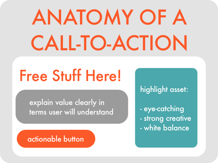
To truly optimize your individual paid campaigns, you should get far more granular with your CRO. This will include taking your actual value proposition under investigation. Here are a few questions you may want to ask yourself regarding the psychology of your landing page and CTA:
- Where is my user in the buyer's journey?
- Are they in the right stage for this conversion?
- Is what we are offering convenient/valuable enough?
- Does our offer align with the information we're asking for?
You'd be surprised how often your CTA issue is offer-related as well as copy-related. Too many marketing managers are focusing on fixing their landing page copy, when they should be asking their CMOs to consider changing what they offer in the first place.
Results from our CTA psychoanalysis study [SaaS]
The best insights are built on hard-earned data — so we decided to get some for you before we started. The CTA Psychoanalysis Spreadsheet (which you can click the image to download for free) analyzed the CTAs of the top 100 SaaS landing pages:
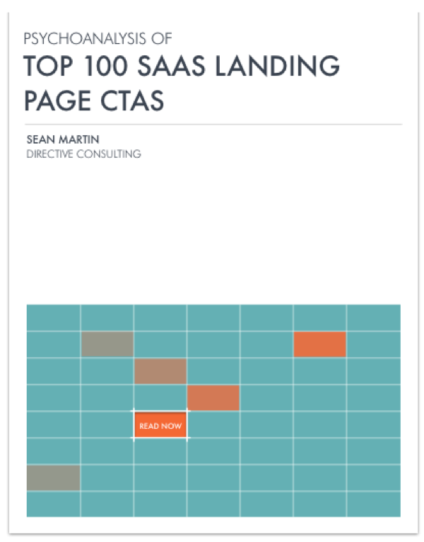
What we found in the study is that most CTA issues fall under one of four categories:
1. Clarity
The main issue here is that the goal conversion of the page is unclear. This can be because you are using vague copy (like "click here") on your buttons. Or it could come from your landing page lacking the necessary information to educate your user on their need for your service.
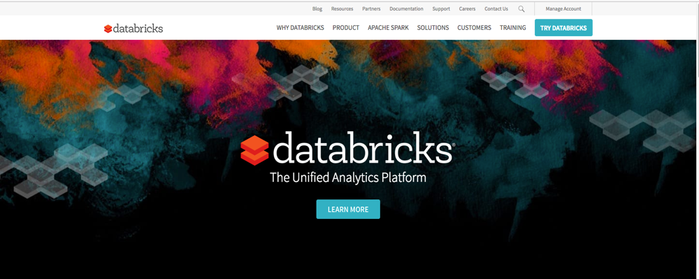
As you can see in the screenshot below, the landing page may look clean but it lacks any helpful information to educate the user on why they should convert. Especially for early-stage searchers, this page might as well be a black-hole of mystery and friction.
Make sure that your landing page has any necessary information your user needs to be adequately informed on your product/service. Here are a few things to focus on:
- Time-saving value of your product
- Competitive pricing of your product/services
- The exact pain point your product/service solves
2. Timing
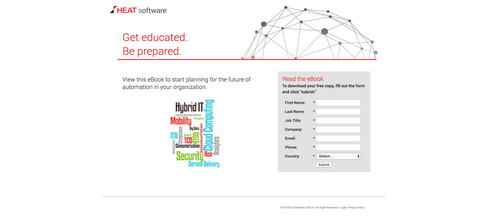
Here we saw that many landing pages were offering assets to the user that were not appropriate for where they were in the buyer's journey. For example, if a user hasn’t been given the right contextual information to understand their need for your service, offering a free trial in your CTA is a bit misplaced.
The same goes for offering digital assets with zero explanation of what they are:
Make sure that your offer properly aligns with where your user is in the buyer’s journey.
- Top-funnel offers just ask for contact information
- Mid-funnel offers can push branded experiences like email subscription
- Bottom-funnel offers get to focus on scheduling meetings and calls
Lastly, whatever you offer, make sure you explain what they heck the user is downloading so they aren’t blindly clicking spam.
3. Friction
Whenever you're asking for contact information from a user, you need to walk a fine line between value and friction. The more information you ask for (name, email, business, competitors, etc.) the more friction you're going to force on your landing page.
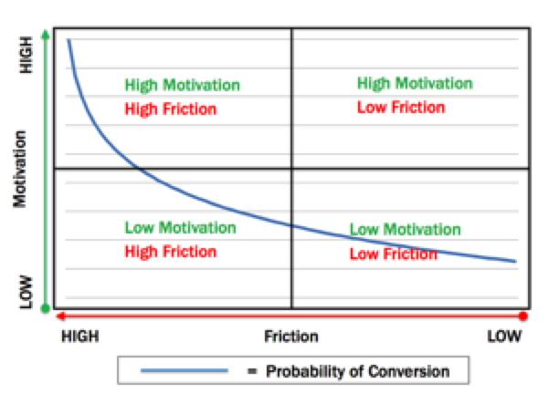
If your forms are asking for every bit of information your user could possibly supply, they're probably bouncing off en masse. Make sure what you ask for is equal to what you offer.
The majority of B2B search marketers report that the form field “sweet spot” for conversions is somewhere between 3–5. Any more than that and you start pushing users away.
4. Placement
This has been, and always will be, an issue for CTAs. Online readers aren't known for their attention spans — and you only have a few seconds to grab and hold their attention.
This means that your goal conversion (your CTA) should be highlighted and attention-grabbing. At the least, it should be visible immediately when you land on the page. You'd be surprised how many sites we still see with nearly invisible CTA buttons buried under a forest of irrelevant images:
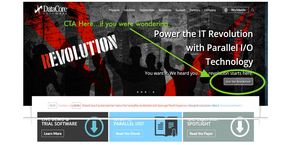
Pro tip? Make sure your buttons are easily found... that is, only if you want your users to click them.
These are just the common issues we ran into while studying an entire industry. While these prove that there are many common CTA issues that can be easily fixed, it doesn't prove how impactful fixing them can be.
To see just how powerful optimizing your CTAs can be, keep reading.
3 B2B case studies to prove the power of CTAs
Now I did just lay out that there are four primary issues to handle when it comes to CTAs. But the last issue (placement) can be fixed fairly easily. As long as your button is clear and visible with plenty of empty space to isolate the goal conversion, you should be in the clear.
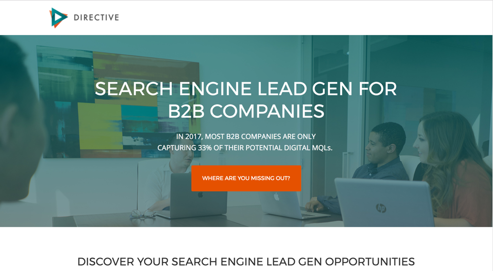
But when it comes to the other three CTA issues, fixing them can get a bit more complex. We've found that breaking down the psychology of the landing page interaction is a great way to reverse-engineer the buyer's journey to your site.
Through this, we've been able to test some aggressive CRO strategies with our clients' campaigns. What we've seen is that the most impactful changes come from addressing either:
- Convenience of the conversion
- Copy of your button and landing page
- Landing page offer or gated asset
B2B search marketing is all about understanding the nuances of your end customer and where to ideally place your brand in order to convert them. If you really want to streamline your buyer's journey, you'll dive deep into these CRO puzzles.
Case study 1: Changing the CTA convenience

We were able to drastically increases this client’s conversions by optimizing their CTA. In this instance, "optimizing" refers to making the conversion more convenient for their users.
The goal of their landing page was to fill their pipeline with qualified leads interested in scheduling a demo. This is a great lead-gen tactic, and the landing page was a clean, streamlined experience.
But what we realized was that "scheduling" a demo can cause serious hesitation in users. Scheduling requires them to go into their own calendar and consult when they’re free and can match your company's schedule.
To make the conversion more convenient, we created a demo video that was available for download. Luckily, the client already had a great video asset that we could use.
This way, instead of trying to consolidate two calendars (user's and company's), the user could download the video and watch at their discretion. (On the left: “Schedule a Demo Today!” & on the right: “FREE 5 Min Demo Video”)

When it comes to convenience, it's important that you speak to users not only in terms of dollars, but time. While money is always a resource that we want to save, time is an invaluable and infinite resource that we are all constantly clamoring for more of. If you really want to impress users, start speaking to them in terms of time-saving value. You can see from the screenshot below that doing so will prove worthwhile.

That's right — we saw over 738% increase in conversions by making the process more convenient for users. That's some serious conversion rate optimization — which leads to some serious revenue.
Case study 2: Changing the CTA copy

By optimizing the exact phrasing of this software site’s CTA button, we were able to drastically increase their paid leads.
Now, if you are running any sort of serious landing page campaign, your CTAs will explicitly state the goal conversion of your page. For example, a "click here" button simply isn't going to cut it. If you are telling them to read a blog, download an e-book, or schedule a meeting, your CTAs should read accordingly: "Read now," "Download e-book," "Get in touch."
But copy-focused CRO goes beyond just focusing your CTAs. A/B testing your button copy to see which variants convert more of the traffic your ads generate is also key. In this case, we tested whether the industry-oriented copy or the value-oriented copy would convert higher.

Originally, the button read only "Watch the Demo Video" — a CTA that we knew worked from the previous test above. We tested the two screenshots in two different targeted markets.
The first (MES Software) was targeted towards industry experts who would hopefully react to the specific copy. The second (Free) was for everyone else. The results were quite interesting:
- "MES Software" Results: 8.18% increase in conversions
- "Free" Results: 9.49% increase in conversions
We can see from the results that targeting your CTA copy towards your target market's vocabulary does work quite well. But, as in most cases, emphasizing that the asset is free of charge eliminates nearly all friction from the experience, which resulted in a serious increase in conversions.
Thus far we've seen that changing the CTA to cater to your user's convenience results in serious increases in conversions. Emphasizing a great deal with "free" in your copy also work incredibly well.
The more value you convey through your button's copy (whether it's monetary with "free" or expertise with "MES") the more success you're likely to see. But what happens when you change your landing page's offer altogether?
Case study 3: Changing the CTA offer

What we saw in this third campaign is that oftentimes there are multiple search intents behind the traffic your paid ads are generating. This means that not everyone who clicks through your ad is seeing relevant material if you're running a blanket campaign.
But these clicks are still potential leads that you are leaving on the table. Don't let them bounce off. Create a custom experience for each of your distinct search intents. Don’t just stop at niche — go all the way to creating custom experiences for singular searchers!
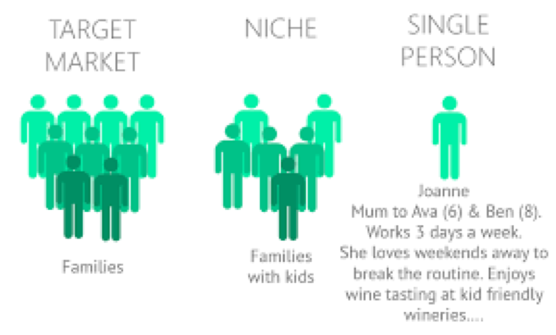
Previously, this landing page CTA was focused on a singular goal (scheduling a demo), but there were multiple search intents behind who was clicking on their ad. Because of this we were seeing a lot of bounces.
After we looked at the data, we realized that we could create a custom landing page experience for each of these different search intents. One of these was focused on a certain industry report, the second with a new cybersecurity threat, and the third with the actual brand name in mind.
In the screenshots below, you can see how we created three unique experiences for different expected users:

This newly segmented landing page campaign saw a drastic increase in conversions by targeting each of these different buyer's journeys. The more customized an experience you can provide, the more conversion-prone your user will be.
Instead of hoping that a catch-all ad campaign would generate leads from each of these different intents, try the opposite. Creating a more customized user experience will rarely come back to bite you. After all, the conversion rates of each of these segmented pages speak for themselves:
- Gartner Report Conversion Rates: 36.9%
- NSS Report Conversion Rates: 18.63%
- Healthcare Cybersecurity Conversion Rates: 8.85%
As always, when it comes to digital marketing, segmentation should always yield more success.
Takeaways: Smooth slide to conversion
As far as golden rules go, your CTAs should be following one:
Make conversion easy for your users.
This goes for any interpretation of the word "easy" you can think of. The more convenient your offer and the more value-driven your landing page & button copy, the more enticed your users will be to convert. CRO takes more than just copy and design into consideration.
To truly master your buyer's journey and become an ROI-driven CRO mastermind, you need to analyze the psychology of your paid campaigns. You need to dive deeper into the implications of each market interaction. And — most importantly — you need to implement changes that will drive leads/revenue, not just empty clicks.
The smoother your CTAs, the smoother the slide straight to your sales team.


Great post Sean!
I would add, although is not a common mistake, that you should limit the number of CTAs in screen to a maximum of 2 or 3. Sometiems I've seen 5 different CTAs just above the fold, and that really dilutes the path to follow for the user and drives less conversions.
Totally agree angel. We even often times try to do no more than two.
Great point Angel!
Awesome read. A proper CTA can make all the difference. And it goes beyond CTAs we see on the main page or pricing page.
I personally have an opinion that CTA should always be present where possible, and demand that our content managers add the CTA to any content they make (except for images probably).
If you're writing an article about an automated technical seo audit — prompt readers to check their websites.
Publishing a post about a service update on social media channel — tell people to go and see it in action.
It's such a small change that can't go wrong, people either ignore it, or follow it. And they can't follow it if there's nothing to follow.
So... would you insert CTAs all over a website page? Or have only one per page? (I do know this is not all black and white)
Great read Sean! I work in content marketing for B2B companies and often need to place a CTA within a piece of written content such as a blog or promotional copy. I have found that linking one sentence (requesting the reader to click through to a landing page offer) positioned somewhere within the text of a blog converts well. I imagine this could be because as you say - psychologically speaking some users are further up in the funnel - (e.g. blog readers) and clicking a link to a downloadable resource page (containing the form), seems to require less commitment on the part of the user rather than a form at the end of a piece of text. Perhaps the blog copy got their attention so they clicked through? Interesting that this tactic often works better than the carefully designed CTA form placed at the end of the blog!
I have also tested various CTA formats and their placement, looking to find out which works best. So far pop-up CTAs (as long as the timing is not too instant), generally convert well.I wonder if you had any insight on this?
We have found exit pop-ups do well, but the key is that the CTA fits where they are at in the funnel. You can also use Sumo to see average readership depth and make sure you add your CTA above that point. Make sense??
Two great advices Garrett. I specially liked what you said about including the CTA where it fits in the funnel. This is the mindset to make sure you put the right CTA in the right place, and also makes you re-think about your funnel and your customer journey.
Great point Rachel. As Garrett said that most success we've seen has come from better understanding where your buyer is in the funnel. Often times marketers are bouncing users away with high-friction high-contact-info forms. Wherever these are on your page, more often than not a preliminary user isn't interested in giving up that much information. It's better to ask for nothing but an email and get them into your drip cadence to slowly nurture them over a long period of time. The key is not to jump the gun. You don't have to schedule an intro meeting on your first interaction - in fact shooting for that will probably end up hurting your conversions.
Wow and Wow for real it is amazing how the research you implemented made it so clear to see some solid successful statistics. I think that by having multiple user experience options for the user was brilliant. Too many times we develop only one landing page when you can serve more visitors by mapping out different needs.
I also think that the button copy in terms of keyword and "free" was very interesting as the audience is larger when the term free is there, kinda like why not instead of yes that is exactly what I am looking for.
The last ah ha moment I found in this was the focus on the schedule a meeting vs a 5 min demo. I have been battled with the schedule a demo with many clients, but with that said getting that 5 min video can be hard in its self. Data of success would sway the client to get that done though.
Fantastic and great contribution.
I like the way essential tips have been shared to boost CTA conversions. loved reading it. thanks!
Great post with useful tips!
Great article Garrett. We just buffed our landing page a little to "The exact pain point your product/service solves". I still think we need build a better CTA. I really wanted to hire a video production company to make a promotional video. I think having a video to watch will allow us to engage with people higher on the funnel than demanding that they submit information.
Hi Coleman,
Great idea - videos always tend to perform better on landing pages as they are simply better at grabbing and holding the user's attention. You might even want to try making the video a downloadable take-home asset to gate. This way, you users still are getting all that helpful, convenient, and engaging info plus they are entering your pipeline. Having a take home asset should help boost your conversions as well.
Great post Sean!! In addition to your great advice, I would also add that it also depends on where a visitor's geographic location with CTA text/offer. We had a B2B client who has an international presence, and the German pages weren't converting as well as the U.S. pages (same copy and same CTA). We spoke with a regional expert who advised changing the copy of the page to fit a German visitor's needs, and changed the language of the CTA (from an exact translation from English to how someone in German would ask the question).
Great post..These 3 case studies are really helpful and also generate leads..
Hi,
Thanks Sean for this article.
I just loved the 3 cases with their increase/decrease.
That is what we need.
Cheers,
Nice post Sean,
CTA is the trigger that can bring the success to our business, but a lot of companies still not using it properly. I think they should come here and learn a bit...
Thanks to keep teaching us ;-)
I have been "studying" conversion rate optimization for the last 2 or 3 years. The more I read thoughtful articles (such as this one), the more I am convinced CRO may be the most important thing a marketer can do. Sure you can grow a business if you can constantly find new people to bring into a mediocre conversion funnel, but we decided we first wanted to be better at converting the people who were already coming to our website. We called it "winning our home games" and this exercise, which was very similar to the structure Sean shared (even if we didn't know it at the time), forced us to optimize value propositions and CTAs. Across the entire domain, we improved the conversion rate by 30% -- a number I'm extra proud of considering the products we sell tend to cost between $2000 and $4000.
Excellent thoughts there. Really made me think about my email process. Appreciate the research you did for this article, I enjoyed it.
Good article but there are a couple of errors you might want to fix.
On the Friction vs Motivation graphic, the Probability of Conversion line should be highest in the high motivation/low friction quadrant and lowest in the low motivation/high friction quadrant. So the line should run from the lower left to the upper right.
You also state"...time is an invaluable and infinite resource...". I think you meant to say that time is a finite resource.
Well said Eric. I also spotted these issues, and it was good to see I was not alone.
Hey Sean - great post.
Just one clarification on the first case study where they offered a free download of the demo.
Did they ask for an email to be able to download the demo?
If not, how did they capture the email or other contact info after the download?
Thx!
Hi there Anuj,
We actually used the same form for the "schedule a demo" and "download free demo video" CTAs. So they both had the email form field. The main differentiator for the conversions was the idea that our users could download a take home asset as opposed to having to coordinate scheduling options with the agency in question - making it more convenient for the users while still collecting all the same info.
Make sense?
It does - thanks for clarifying.
I'm i correct that in your first case the control saw 10 times less traffic than the variant?
The thing with CTA's is that the design constantly changes but the copy stays the same. User's psychology seems to be still based on the same principles. If it has value for the user, then why not to click. Great article! Cheers, Martin
Great stuff. CTA's are really something that people can't seem to get right, but doing them well can mean so much in terms of increasing your lead generation.
The power of the CTA's is often overlooked. Great stuff here!