It's not every day that I write about content. To be honest, it's probably a once-a-year kind of thing. I will readily admit that I'm a "links are king" kind of SEO, and have been since starting in this industry more than a decade ago. However, I do look over the fence from time to time to see if the grass is greener and, on occasion, I actually like what I see. Prior to joining Moz, I was a consultant at an agency like many of you reading this blog post. More often than not, one of the key concerns of my clients was what to write about. It seems that webmasters and business owners alike can easily acquire writer's block after trudging through the uninspiring task of turning a list of keywords into website copy. So where do you look when you have run out of words
Numbers.
Alright, stick with me here. I imagine for some of you the idea of poring over numbers to remedy writer's block would be like trying to stop a headache with a brick. It's adding insult to injury. What I hope to show you in the next couple of paragraphs is how data can be an incredible source of inspiration in writing, especially if you can hit a few key principles: expose, relate, surprise, and share.
Expose
Chances are your business or website generates some amount of unique, first party data that you can expose to the world. It might be from analytics, your rank tracker like Moz, or from raw user data if you operate a forum. I'll give you examples of how you might tap into these resources (especially when they don't seem obvious or plenteous) but let's start with a canonical example of one great use of first-party data in an industry that seems directly at odds with — dating.
The thought of quantifying and analyzing our love lives seems like an oxymoron of sorts. However, one of the most successful uses of data for content has been produced by the team at OK Cupid, whose "data"-tagged blog posts have earned thousands of solid backlinks and enviable traffic. The team at OK Cupid accomplishes this by tapping their huge resource for unique data, generated by their user base. Let's look at one quick example: Congrats Graduates: No One Gives a Sh*t.

The blog post is fairly straightforward (and not particularly long) but it used unique data that isn't really available to the average person. Because OK Cupid is in a privileged position, they can provide this kind of insight to their audience at large.
But maybe you don't have a million customers with profiles on your site; where can you look for first party data? Well, here are a couple of ideas of the types of data your company or organization might have which can easily be turned into interesting content:
- Google Analytics, Search Console data and Adwords data: Do you see trends around holidays that are interesting? Perhaps you notice that more people search for certain keywords at certain times. This could be even more interesting if there's a local holiday (like a festival or event) that makes your data unique from the rest of the country.
- Sales data: When do your sales go up or down? Do they coincide with events? Or do they happen to coincide with completely different types of keywords? Try using Google Correlate, which will identify keywords that follow the same patterns as your data.
- Survey data: Use your sales or lead history to run surveys and generate insightful content.
- A clothing store could compare responses to questions about personality by the colors of clothing that people purchase (Potential headline: Is It True What They Say About Red?)
- A car parts store could compare the size of certain accessories to favorite sports (Potential headline: Big Trucks and Big Hits)
- An insurance provider could compare the type of insurance requested vs. the level of education (Potential headline: What Smart People Do Differently with Insurance)
There are probably tons more sources of unique, first-party data that you or your business have generated over the years which can be turned into great content. If you dig through the data long enough, you'll hit pay dirt.
Relate
Data is foreign. It's a language almost no one speaks in their day-to-day conversations, a notation meant for machines. This consideration requires that we make data immediately relatable to our readers. We shouldn't just ask "What does the data say?", but instead "What does the data say to me?" How we make data relatable is simple — organize your data by how people identify themselves. This can be geographic, economic, biological, social, or cultural distinctions with which we regularly categorize ourselves.
Many of the best examples of this kind of strategy involve geography (perhaps because everyone lives somewhere, and it's pretty non-controversial to make generic claims about one location or another). Take a look at a map of your country and try not to look first towards where you live. I'm a North Carolinian, and I almost immediately find myself interested in anything that compares my state to others.
So maybe you aren't OK Cupid with millions of users and you can't find unique data to share — don't worry, there's still hope. The example below is a rather ingenious method of using Google Adwords data to build a geographical story that's relatable to any potential customer in the United States. The webmasters at Opulent used state-level Keyword Planner to visualize popularity across the country in a piece they call the "State of Style."
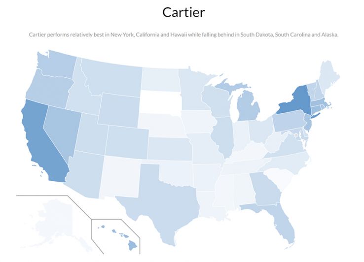
When I found this on Reddit's DataIsBeautiful (where most of these examples come from), I immediately checked to see what performed best in North Carolina. I honestly couldn't care less about popular fashion or jewelry brands, but my interest in North Carolina eclipsed that lack of interest. Geography-based data visualization has produced successful content related to in sports, politics, beer, and even knitting.
If you walk away with any practical ideas from this post, I think this example has got to be it. Fire up an Adwords campaign and find out how consumer demand breaks down in your industry at a state-by-state level. Are you a marketer and want to attract clients in a particular sector? Here's your chance to write a whitepaper on national demand. If you're a local business, you can target Google Keyword Planner to your city and compare it to other cities around the country.
Surprise
Perhaps the greatest opportunity with data-focused content is the chance to truly surprise your reader. There's something exciting about learning an interesting fact (who hasn't seen one of these lying around and didn't pick it up?). So, how do you make your data "pop?" How do you make numbers fascinating?
Perspective.
Let's start with a simple statistic:
The cost of ending polio between 2013 and 2018 is
$5.5 Billion Dollars.
How does that number feel to you? Does it feel big or little? Is it interesting on its own? Probably not, let's try and spice it up a bit.
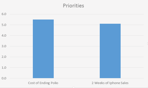
$5.5 billion dollars doesn't seem that much when you realize people spend that amount on iPhones every 2 weeks. We could rid the world of polio for that much! Or, what if we present it like this...
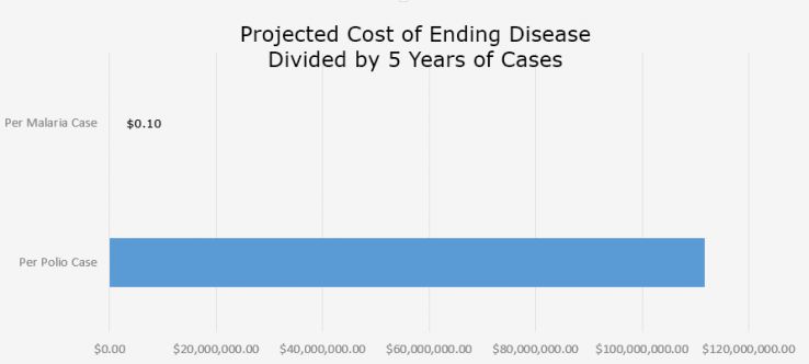
In this light, it seems almost insane to spend that much money preventing just a couple more polio cases relative to the huge gains we could make on malaria. Of course, the statistics don't tell the full story. Polio is in the end-stages of eradication where the cost-per-case is much higher, and as malaria is attacked, it too will see cost-per-case increase. But the point remains the same: by giving the polio numbers some sort of context, some sort of forced perspective, we make the data far more intriguing and appealing.
So how would this work with content for your own site? Let's look at an example from BestPlay.co, which wrote a piece on Board Games are Getting Worse. Board games aren't a data-centric industry, but that doesn't keep them from producing awesome content with data. Here's a generic graph they provide in the piece which shows off average board game ratings.
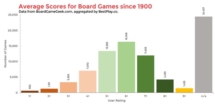
There really isn't much to see here. There's nothing intrinsically shocking about the data as we look at it. So how do they add perspective to make their point and give the user intrigue? Simple — apply a historical perspective.
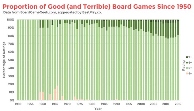
With this historical perspective, we can see board game scores getting better and better up until 2012, when they began to take a dive — the first multi-year dive in their recorded history. To draw users in, you use comparison to provide surprising perspectives.
Share
This final method is the one that I think is most overlooked. Once you've created your fancy piece of content, let your audience do some leg work for you by releasing the data set. There's an entire community of the Internet just looking for great data sets which could take advantage of your data and cite your content in their own publications. You can find everything from All of Donald Trump's Tweets to Everything Lost at TSA to Hand-drawn Pictures of Pineapples. While there is a good chance your data set won't ever be used, it can pick up a couple of extra links in the event that it does.
Putting it all together
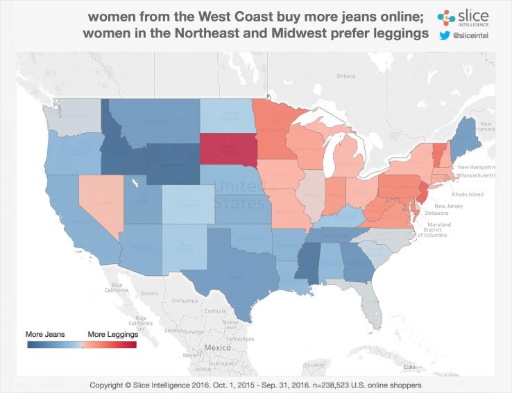
What happens when a webmaster combines these types of methods — exposing unique data, making it relatable and surprising, even for a topic that seems averse to data? You get something like this: Jeans vs. Leggings.
This piece played the geography card for relatability:
They compared user interest in jeans to give perspective to the growth of demand for leggings:
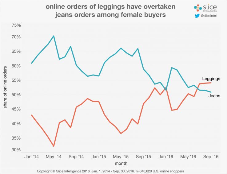
Slice.com reveals their first-party data to make interesting, data-driven content that ultimately scores them links from sites like In Style Magazine, Shape.com, and the NY Post. Looking at fashion through the lens of data meant great traffic and great shares.
How do I get started?
Get down and dirty with the data. Don't wait until you end up with a nice report in your hand, but start slicing and dicing things looking for interesting patterns or results. You can start with the data you already have: Google Analytics, Google Search Console, Google Adwords, and, if you're a Moz customer, even your rank tracking data or keyword research data. If none of these avenues work, dig through the amazing data resources found on Reddit or WebHose. Look for a story in the numbers by relating the data to your audience and making comparisons to provide perspective. It isn't a foolproof formula, but it is pretty close. The right slice of data will cut straight through writer's block.


Great post, Russ. We love data-based content pieces and I'd say that half of what we produce is based around unique data. When we run into situations where the client's data can't be shared, or we need more interesting data, we'll often turn to Google Consumer Surveys to collect unique data. For typically less than $1k, we can survey a specific demographic and get back the statistically significant data we were looking for.
For example, if we have a customer in home decor, we might do a survey around home decor trends. GCS makes looking at cross-tabs easy, so we can find those compelling correlations that help create those sexy headlines to promote to the top of r/dataisbeautiful.
I considered GCS for this post too. It is an amazing tool but I couldnt find an example in time for post. Know of any?
Sure, here are two examples we've done with GCS (both the content piece and an outlet that picked it up):
A sleep survey on http://blog.nextdayblinds.com/the-2017-sleep-surve... that was picked up by TheKnot: https://www.theknot.com/content/relationship-sleep...
Dating Apps: Just for Hookups? https://simpletexting.com/dating-app-survey/ that was picked up by Bustle: https://www.bustle.com/p/how-many-people-who-meet-...
Here's another one we did recently which shows the cost of beer per state. It wasn't GCS, but you can see that it just took a little bit of legwork and it really paid off with pickup including http://www.foodandwine.com/news/how-much-case-of-b... and https://www.thrillist.com/news/nation/map-shows-ca... - like you identified, maps are awesome. We've had good success promoting maps to local outlets in each state (this one was picked up by a bunch of local TV affiliates and radio stations across the country) and also on tons of location-specific subreddits.
Russ,
If you're on the content horse now, we're all about to be run out of town. I'm a big fan of the OKCupid data site as well, in large part because they share some interesting insights we don't often think of, or at least not in the way in which they express them.
I also enjoy the site for the same reasons you make plain in the post: to see how they turn simple but unique information/data into compelling visuals, including graphs and charts.
It is, as you assert, absolutely the type of information businesses of all sizes and verticals can use to create an engine for content, allowing to create content that gets found, share, linked to and has the phone ringing.
The process is even more beneficial for smaller, local businesses.
A few examples from my own work include:
There are always numbers around us; use them.
RS
That's a great idea Ronell! Particularly with the fishing tackle manufacturer's example. Did you try writing that blog post and could you share the results?
Thanks Russ, great post here. Data driven posts are something we'd love to be able to do, but just haven't had the head space to delve in to it up to this point. This gives us a great starter for ten, but I think some of the concepts you've discussed here can be more generically applied too!
In the UK we can make a freedom of information request: essentially we can ask for pretty much any data from a specified government body and they can't refuse the request. We've used this to map out the most dangerous roads with road traffic accident statistics, find cybercrime stats, operation success rates in hospitals etc. - really useful.
I have always heard that people love numbers, especially odd numbers in titles. I actually have 13 kinds of data that generates crazy clicks, you'll never believe what number 11 is.
Great read, Russ! I'm a big fan of using data for content.
SuperOffice did something similar recently by analyzing 1,000 websites to see how they use live chat for customer service. Full study (with charts) here
Love this because it's got an obvious call to action within the data, rather than just "here's something cool...now buy our stuff"
Some nice ideas on how to get creative with data. I find that getting an angle on topical industry data (together with great graphics) have been the most popular with our audiences.
I love making sure all of my Data is correct. Makes me feel a lot better about my self when i know exactly what is going on which also increases your work load. Allowing you to do more work. Great Post Russ thank you for this!
Love this post and your charts Russ! Definitely backs up the "a picture is worth a thousand words" mentality. I am a "link-building" type of SEO as well, but also I believe great, well-written content, along with awesome charts and graphs like the ones you put together here can be extremely effective for SEO and branding as well.
Whats cool is to look at the number of unique linking root domains that a new okcupid blog gets vs a yahoo news article
It is a good idea to look at and inquire about the data in monthly and country search terms. It depends a little on the theme of the web and where it is focused. It can focus on a particular country or target the whole world. In my case my favorite tool is adwords. I observe the monthly searches and above all I choose long tail keywords, so that there is less competition so much that there is not an excessive or much smaller number of searches, but a medium term.
It is very important to carry out a key strategy, because if we do not, our work may not serve
Thanks for your contribution and greetings
Hi Russ,
Brilliant ideas. I am running a Property Management Firm called safeprops, that too only in one city. Could you help me look for some data points that I can pull out and make great content. ?
I like especially the last paragraph for the "better done than perfect" style. I think it's absolutely true. Cheers, Martin
Hi,
thanks for sharing this article. Some points which we generally ignore are:
1. Content with proper subheading
2. Focus on Title
3. Should focus on quality of content not quantity.
But one thing i just want to ask, what about those sites which still needed 500 or 600 words article. How can we make a 600-700 article as user friendly as 300 words content???
Waiting for response!!
Thanks
for me search as we know it is changing, with keywords and match types giving way to a more audience-powered approach.
Love this content, thanks.
Great article, If you write actionable content, search engines will help your site to get more exposure.
Nice post, Data and Stats driven content always have a better engagement with readers.
Great post Russ!
I also think links are king, they are a great help and we should not neglect linkbuilding but we should also pay close attention to creating content that can be a major source of traffic.
This is some great advice here! Very helpful for people in my line of business.
Thanks for sharing.. Great post.. You said right.. event or festival according user search the certain keywords so always check your data trends on Google Analytics, Search Console, Moz and other tools use related that types of keywords for produce the traffic and create the sales..
Your content has been great for me to use more keys for my content. I think I'll look perfect after this. Thank you very much, and congratulations.